Visual Language
We introduced a simpler, cleaner version of the Beans n Cream logo and visual language and added a smattering of other fun branded graphics.


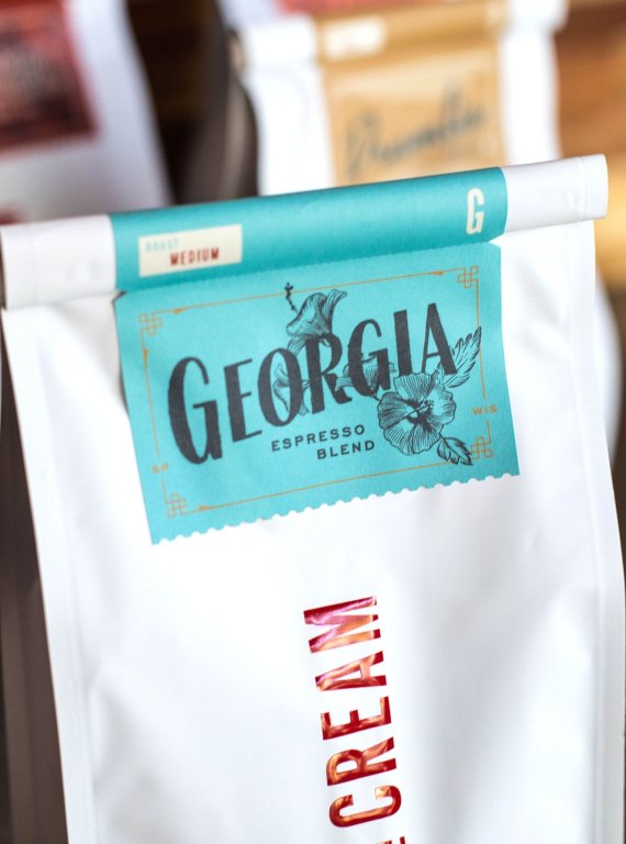
The primary packaging included clean, white custom bags to contrast the more ornate labels.

Main Coffee Packaging


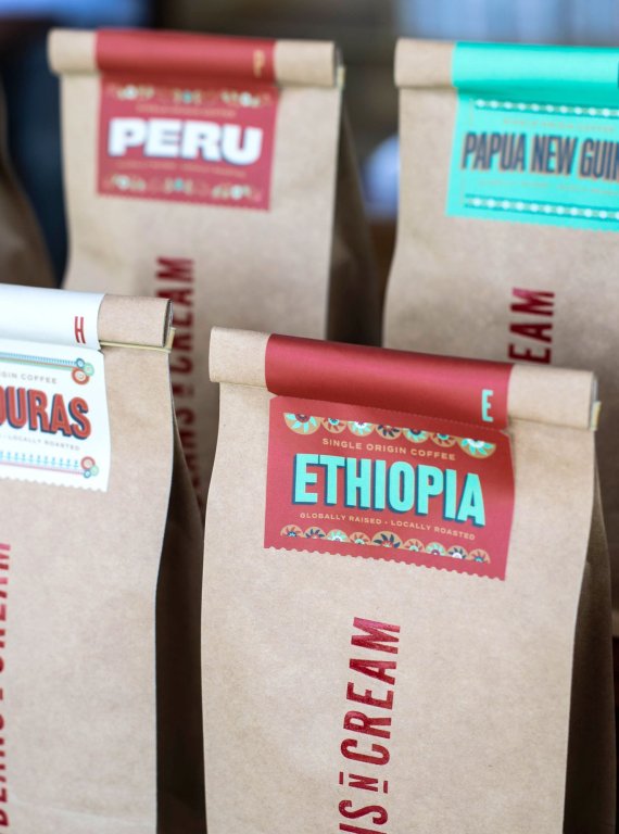
Single-origin roasts used sustainable custom kraft bags to set them apart from the more mainstream roasts.

Single-Origin Coffee Packaging


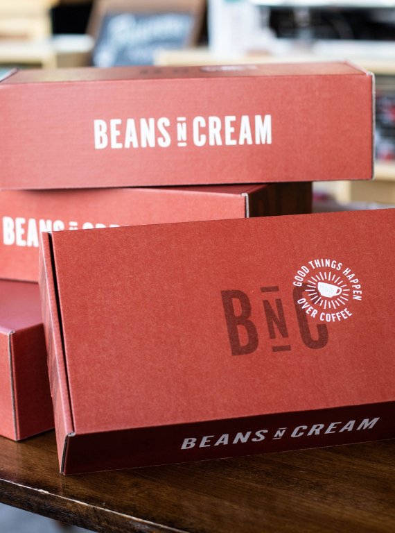
We also began to bring the design language in store with coordinated exterior graphics, product tags, and custom gift boxes.


