
Boardman Clark
Boardman Clark is one of the largest, most prestigious law firms in Wisconsin, with roots dating back to the 1800s (and Fightin’ Bob La Follette!). After a merger doubled the size of the firm, the attorneys at Boardman Clark came to Swink to help articulate a new shared vision.
- Brand Strategy
- Visual Identity
- Web
- Motion
- Environmental

A brilliantly human touch
Boardman Clark is not your typical pointy-lapels-and-mahogany-desks law firm. To a person, the firm is filled with approachable, compassionate people. Everyone greets you with a smile and sensible shoes. The offices are sunny and bright. All the while, they have earned an unshakable reputation for getting results. It’s disarming. And kinda great.
Logo
At the center of the identity is a clean, simple north star, hinting at the guidance they provide each client. Like the firm, the mark is a composite, built from four overlapping pieces, and complemented by clear, contemporary typography.
As a bonus for those in the know, the highlighted piece corresponds with their headquarter’s location on Madison’s capitol square.
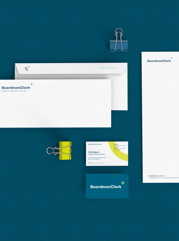

Stationary

Color
We chose a color palette that offers a moment of respite from life’s turbulent moments, anchored by a confident moment of action.

Wall Signage

Magazine ad
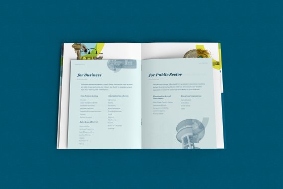
Composite
The heart of the identity are custom compositions that balance old and new, authority and warmth, and that showcase the diverse practices and personalities of the firm.
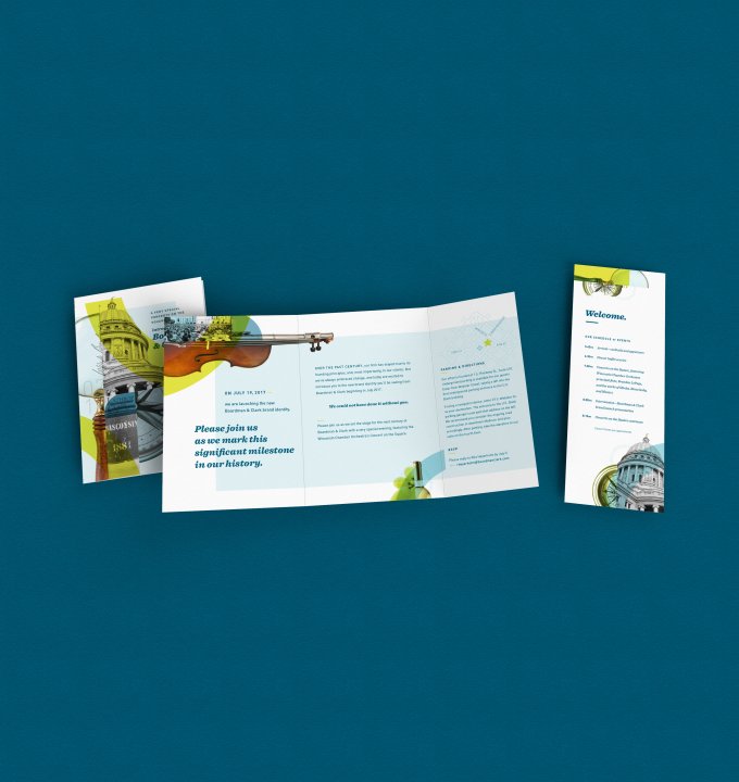
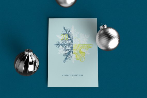
Sales Brochure, Event Invitation, Holiday Greeting Card
Website
Boardman Clark’s primary marketing tool, rebuilt from the ground up to accommodate the firm’s many audiences, and to feature the full breadth of the attorneys’ experience and expertise.

Website Home page and Mobile view

Website Interior page

Website Mobile views
Launch Video
We created a short introduction to the new brand for stakeholders, clients, and friends.
Launch event video
Swink are great designers, certainly. But they are great thinkers, great strategists, great project managers, and just great partners. That is why we now have a brand that is technically solid and aesthetically beautiful — one that works for us, seemingly effortlessly, to tell our story and separate us from all the rest.
NICK SAYERS Director of Communications